 info@zinavo.com
 +91 80-35694395

Introduction
Web developers use responsive web design to ensure that their websites automatically adjust their layout, images and content to fit any screen size. It allows users to have an easy browsing experience whether using a desktop, tablet or smartphone. Responsive design makes it easier to maintain consistency and accessibility across all platforms by using flexible grids, adaptive images and CSS media queries.
A mobile-friendly website improves usability, reduces bounce rates and improves search engine rankings. Search engines are prioritizing mobile-first indexing, so responsive web design is increasingly crucial for businesses. The purpose of this blog is to explain the main principles, best practices and tools that enable websites to be fully responsive and optimized for all devices.
What Is Responsive Web Design?
Responsive Web Design (RWD) is an approach to building websites that automatically adapt to different screen sizes and devices. Instead of creating separate desktop and mobile versions, a responsive site dynamically adjusts its layout, fonts, images and elements to ensure usability everywhere.
It is based on three core techniques: fluid grids, flexible images and CSS media queries. For example:
- On a desktop, you might have a wide, multi-column layout.
- Mobile devices reorganize that same page into a single column for easier reading.
The goal is to provide a consistent experience for users no clicking, zooming or horizontal scrolling required.
Why Responsive Design Matters
The benefits of responsive web design extend beyond appearance. The design impacts user satisfaction, search engine rankings and even revenue. Here’s why it’s so important:
- Enhanced User Experience : A responsive website ensures your visitors can read, navigate and interact easily on any device. Clear text, optimized images and easy navigation lead to higher engagement and lower bounce rates.
- Better Search Engine Rankings : Google’s mobile-first indexing evaluates the mobile version of your website for ranking. A responsive site improves visibility and SEO performance.
- Cost-Effective Maintenance : Managing a single responsive website is far more efficient than maintaining separate desktop and mobile versions. This saves time and reduces long-term costs.
- Improved Loading Speed : Responsive sites typically load faster because they use optimized layouts and images, which directly influence user satisfaction and conversion rates.
- Higher Conversions and Engagement : When users can navigate easily on mobile they’re more likely to take action, whether it’s making a purchase, subscribing or contacting your business.
Core Elements of Responsive Web Design

Creating a responsive website requires combining the right design principles and technical implementation.
1. Fluid Grid Layouts
The traditional fixed-width layout does not scale well across devices. Responsive designs use fluid grids that size the elements proportionally using percentages instead of fixed pixels. This ensures the layout adjusts smoothly to any screen.
2. Flexible Images and Media
Images should resize automatically to adapt to different viewports. The CSS property max-width: 100% ensures images never exceed their container’s size, keeping your layout intact on smaller screens.
3. CSS Media Queries
Media queries allow your CSS to respond to different device characteristics such as width, height, and orientation. For example:

The code above is a simple example but what it’s actually doing is really interesting.
- In considering mobile first, the “column” element is set to have a width of 100%;
- This media query defines rules that apply to viewports with a minimum width of 600 pixels (viewports wider than 600 pixels). The column element will be 50% wider than its parent for viewports wider than 600px.
The adoption and support of many other new CSS features is increasingly widespread in browsers, in addition to media queries, which are essential for responsive web design. One of these important CSS features for responsive web design is Flexbox.
4. Mobile-Friendly Navigation
Navigation must be simple and easy to use on touch screens. The hamburger menu expands when tapped, saving space while keeping navigation accessible. It is recommended to use large, easily tappable buttons in order to optimize mobile navigation. The number of menu items should be kept to a minimum in order to avoid distracting users and to ensure a clean, simple look. Maintain a consistent navigation across all pages to enhance user familiarity and ease of use.
5. Responsive Typography
Text should scale gracefully across devices. Use relative units like em or rem and maintain sufficient line spacing for readability. Avoid using small or fixed font sizes. The best way to implement responsive typography is to determine your base font size by using relative units such as ems or rems, as these units adapt to the user’s preferences. Media queries should be used to adjust font sizes so that text is legible on both small and large screens.
It is also important to maintain an appropriate line height and letter spacing on different devices to improve readability.
Why rem and em?
- rem is relative to the root font size, making scaling consistent.
- em is relative to the parent element, useful for nested elements.
- Media queries adjust font sizes for different devices, improving readability.
Best Practices for Making a Website Mobile-Friendly
Implementing responsive design requires attention to detail. Here are the best practices to follow:
1. Adopt a Mobile-First Approach
The design should be designed for smaller screens first and then expanded to accommodate larger screens. It provides the benefit of keeping your content accessible, since mobile devices are now the primary platform for browsing the Internet.
2. Optimize Images and Media
Large images slow loading times. Use tools like TinyPNG or ImageOptim to compress images and adopt next-generation formats like WebP. Implement lazy loading to delay image loading until they appear on the user’s screen.
3. Simplify navigation.
Navigating the menu should be easy and simple. The number of options should be limited and the clickable areas should be large enough to be operated with a touch. Links that are important should be placed in sticky menus so that they are easily accessible.
4. Test on Multiple Devices
Always test your website across various screen sizes and browsers. Tools like Google’s Mobile-Friendly Test, BrowserStack and CSS Responsive help identify and fix layout or usability issues.
5. Improve Page Speed
Fast-loading websites boost user satisfaction and SEO. Minify CSS and JavaScript, enable caching and use a Content Delivery Network (CDN) to improve performance.
Monitor your website’s performance regularly using tools like Google PageSpeed Insights, GTmetrix and Pingdom. These tools provide insights into speed and optimization issues, allowing you to make ongoing improvements and ensure a smooth user experience.
6. Ensure Touch-Friendly Design
Buttons, links and interactive elements should be well-spaced and easy to tap on. Mobile users will be frustrated if there are tiny clickable areas.
Mobile-Friendly Button & Accessibility Guidelines
- Buttons should be at least 44×44 pixels to accommodate different finger sizes.
- Ample space should be provided between interactive elements to avoid accidental clicks.
- Use larger font sizes to improve readability on small screens.
- Apply high contrast colors for better visibility and accessibility.
- Ensure all clickable elements are easily distinguishable from non-clickable content.
- Consider touch-friendly design principles for a smoother user experience.
7. Focus on Readability and Simplicity
Use clear headings, short paragraphs and high-contrast colors. Break up text into bullet points to improve scanning and readability. Common readability mistakes include using overly complex sentences that can confuse readers and using low-contrast text that makes it difficult to see against the background. Large blocks of text without any breaks can confuse users and discourage them from reading.
The Best Tools for Building Responsive Websites
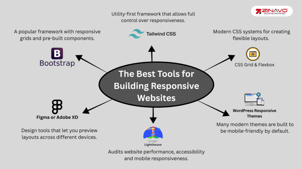
Building a responsive website doesn’t have to be complicated. Here are a few tools and frameworks that make the process easier:
- Bootstrap – A popular framework with responsive grids and pre-built components.
- Tailwind CSS – Utility-first framework that allows full responsive control.
- CSS Grid & Flexbox – Modern CSS systems for creating flexible layouts.
- Figma or Adobe XD – Design tools that let you preview layouts across different devices.
- Google Lighthouse – Audits website performance, accessibility, and mobile responsiveness.
- WordPress Responsive Themes – Many modern themes are built to be mobile-friendly by default.
Common Mistakes to Avoid in Responsive Design
The responsiveness of a website can be compromised by even the most experienced of developers making mistakes. Keep these common issues in mind:
- Using fixed-width containers that don’t adjust to smaller screens.
- Ignore landscape orientation or tablet resolution.
- Loading large, unoptimized images.
- Overlapping elements due to poor CSS breakpoints.
- Ignoring accessibility for screen readers and color contrast.
Fixing these problems early ensures your site works well for everyone, regardless of device or ability.
The SEO Benefits of Responsive Web Design
Responsive design directly supports search engine optimization (SEO) efforts. Google prefers mobile-friendly websites and uses mobile-first indexing, meaning the mobile version of your site determines your rankings.
A single, responsive website also prevents duplicate content issues with separate desktop and mobile versions. It enhances user engagement time, reduces bounce rate and signals to Google that your site offers a positive user experience all key ranking factors. It is important to keep in mind that the faster your site loads, the more crawlable it will be and the more SEO-friendly it will be.
The Future of Responsive Web Design
Responsive design will extend beyond traditional screens into smart TVs, smart watches and foldable devices as technology evolves. The future of web design is in adaptive layouts, AI-driven personalization and progressive web apps (PWAs) that offer an app-like experience.
Businesses that invest in responsive and mobile-friendly design today are better prepared for the next wave of digital innovation.
Conclusion
A responsive website is not just a fashion trend it is an essential component of a successful business. It enhances user experience, boosts SEO and ensures your content reaches audiences on any device, anywhere. Building a future-ready website using flexible grids, media queries and a mobile-first mindset is a great way to make your site load fast, look great and perform smoothly.